student newspaper
About the Project
Description
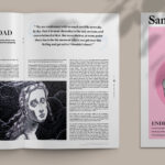
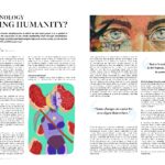
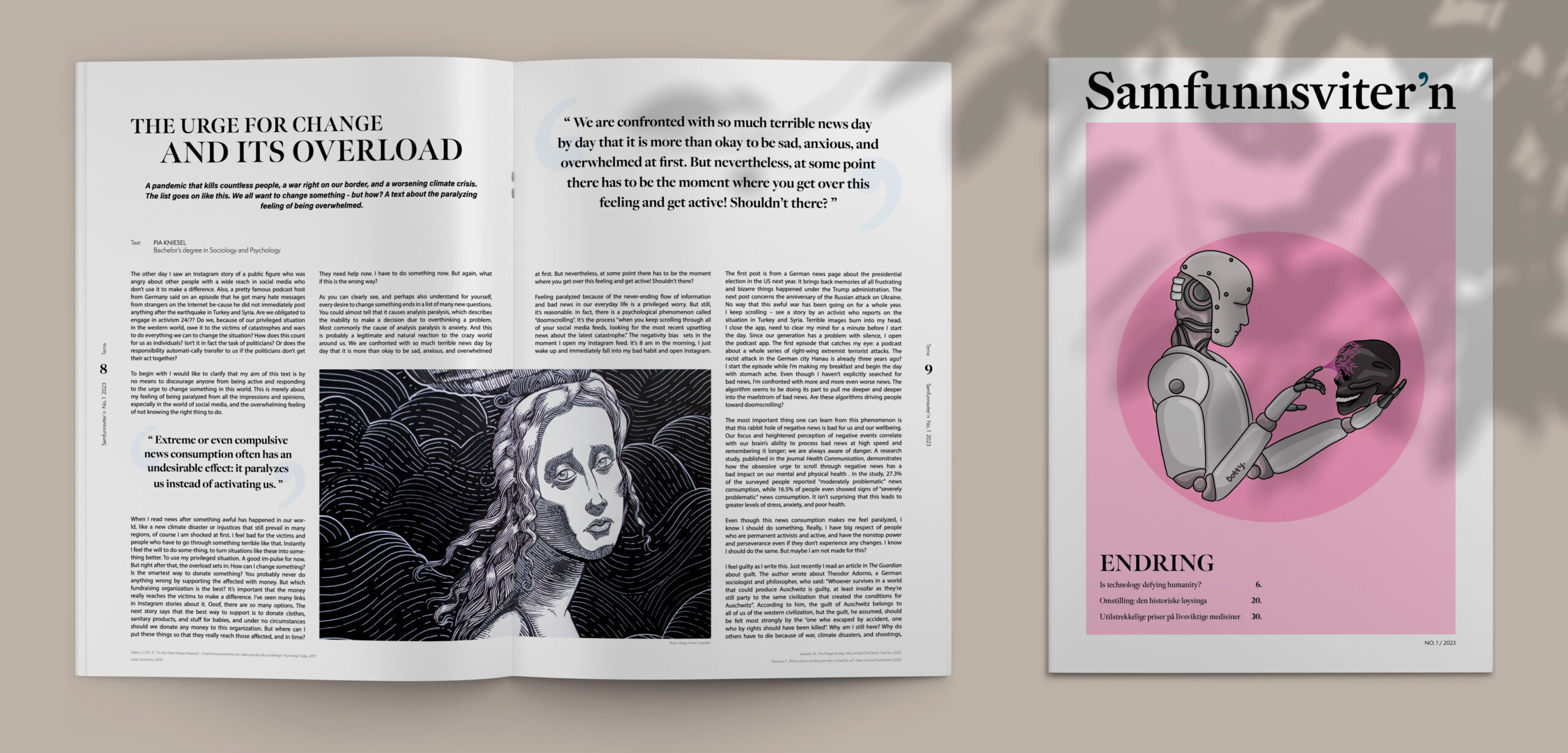
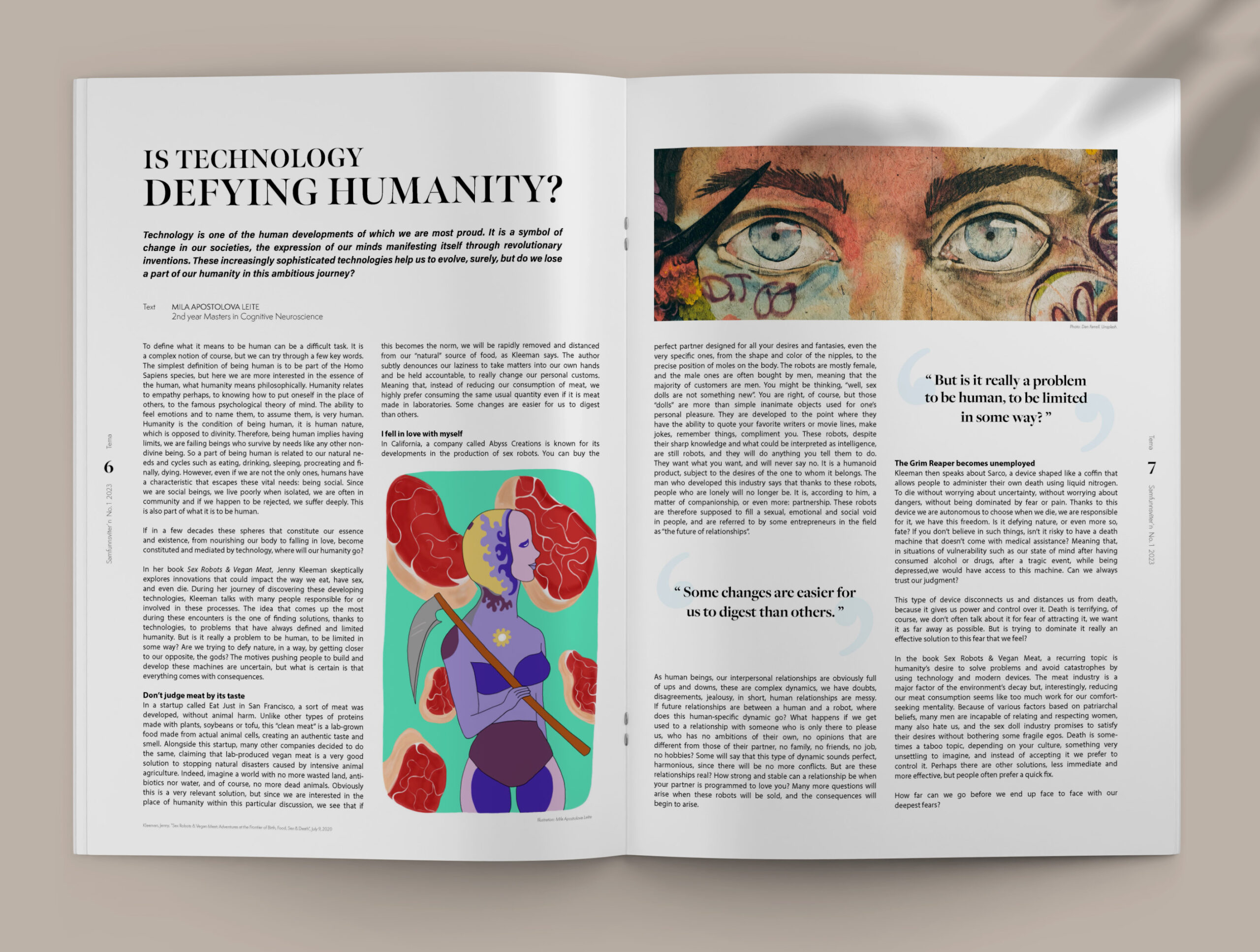
In celebration of its 30th anniversary, I was commissioned to
design the layout and visual identity for the student newspaper “Samfunnsviter´n”.
Duration: 3 weeks
Method: Research, moodboard, sketches, layout, colour theory
Tools: Adobe InDesign, Adobe Illustrator, Adobe Photoshop
Client: “Samfunnsviter´n”, a student organisation at UiO (University of Oslo)
Context
Brief: For the commemoration of its 30th anniversary, I undertook the task of revitalizing the layout and visual identity of the student newspaper “Samfunnsviter´n”, aiming to create an engaging and contemporary design that resonates with its diverse readership.
Problem: The challenge was to rejuvenate the newspaper’s visual appeal while maintaining its established identity, addressing the need for a modern yet familiar design that caters to the evolving tastes of its readership.
Solution: I approached the project by conducting thorough research into current design trends, analyzing the newspaper’s historical design elements, and identifying key preferences of the target audience. By translating the traditional essence with modern design elements, I crafted a fresh layout and visual identity that successfully revitalized the newspaper’s appeal without losing its familiar character.
Learning: This project taught me the delicate balance of preserving tradition while embracing innovation in design. By striking this equilibrium, I learned how to engage an established audience while attracting new readership through strategic design decisions.
