Credit goes to Katja Hasseltvedt for the artwork and illustrations in the app
Credit goes to Katja Hasseltvedt for the artwork and illustrations in the app
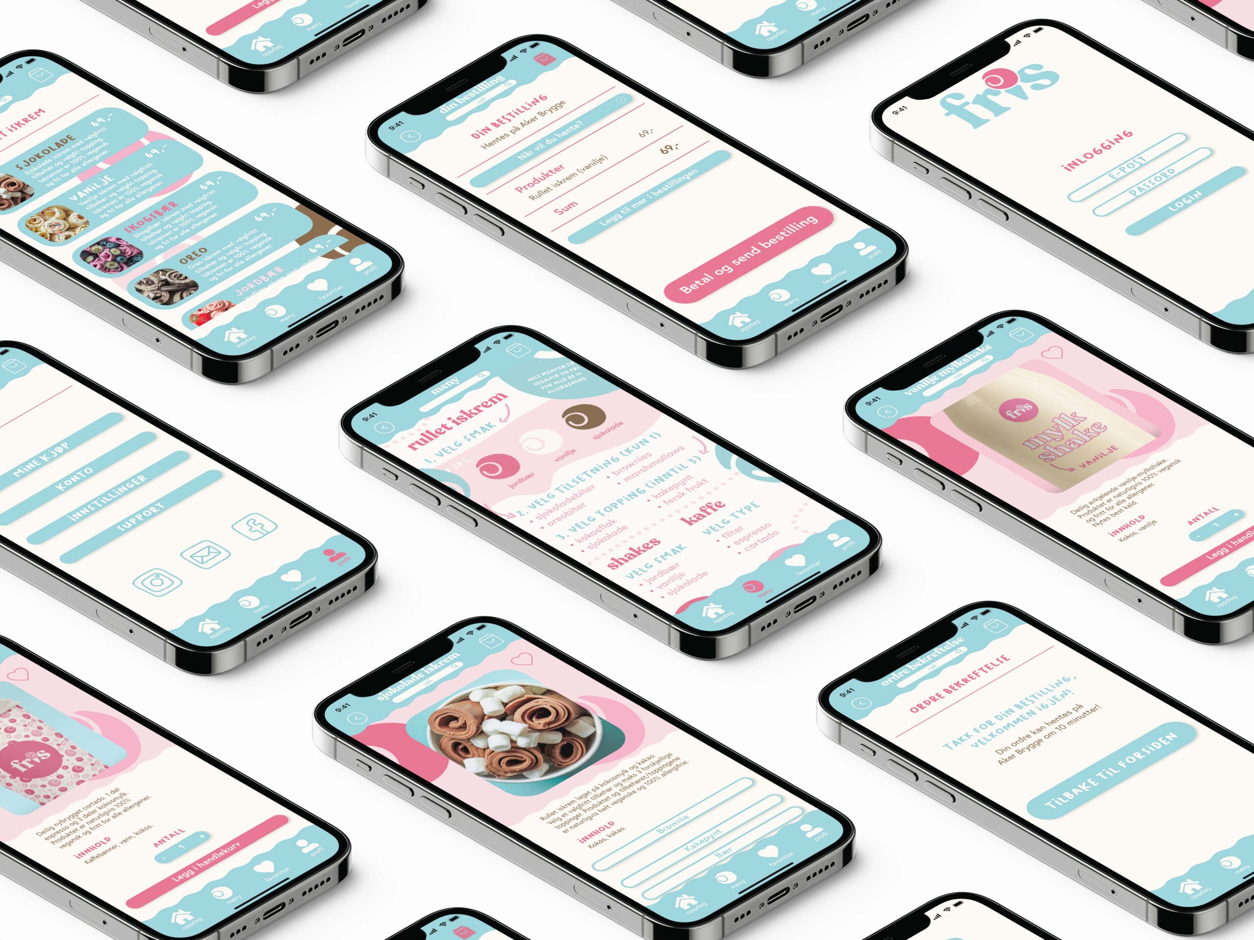
Context
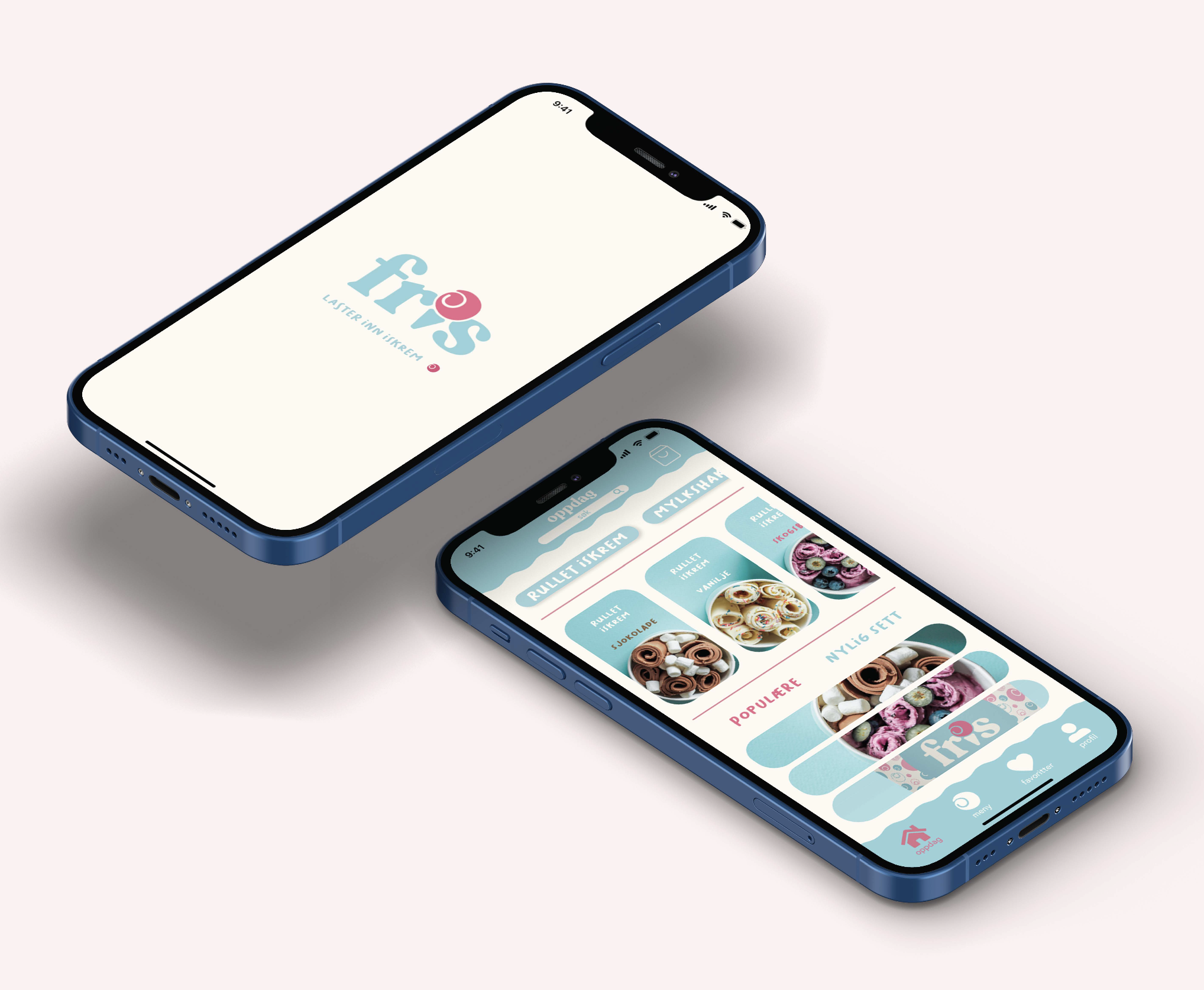
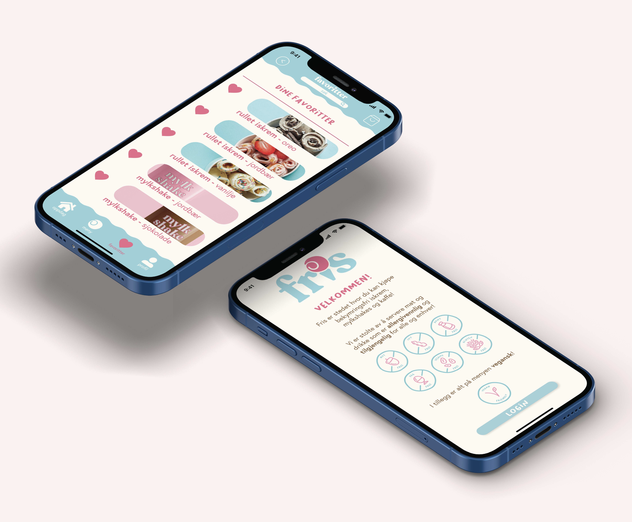
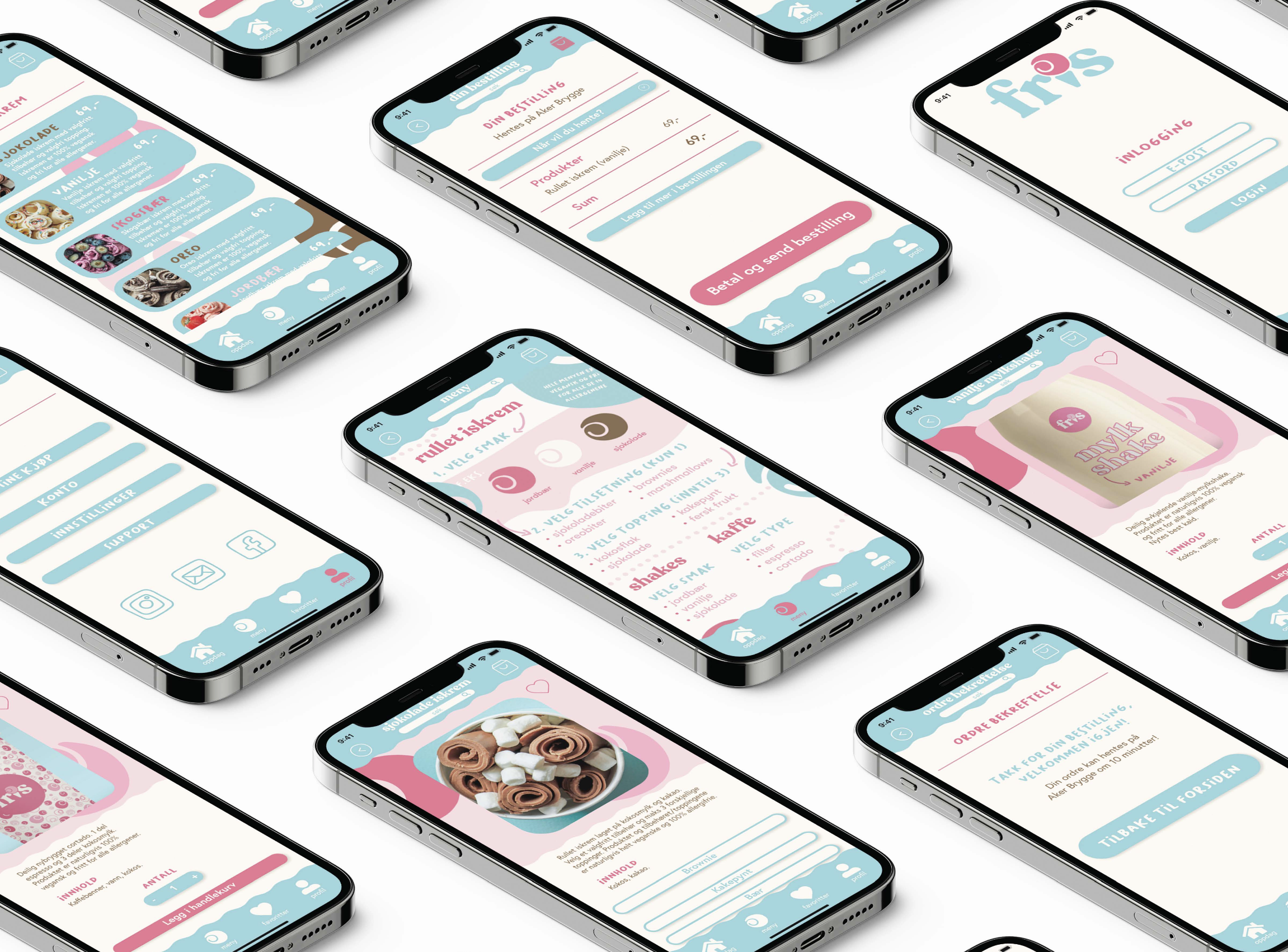
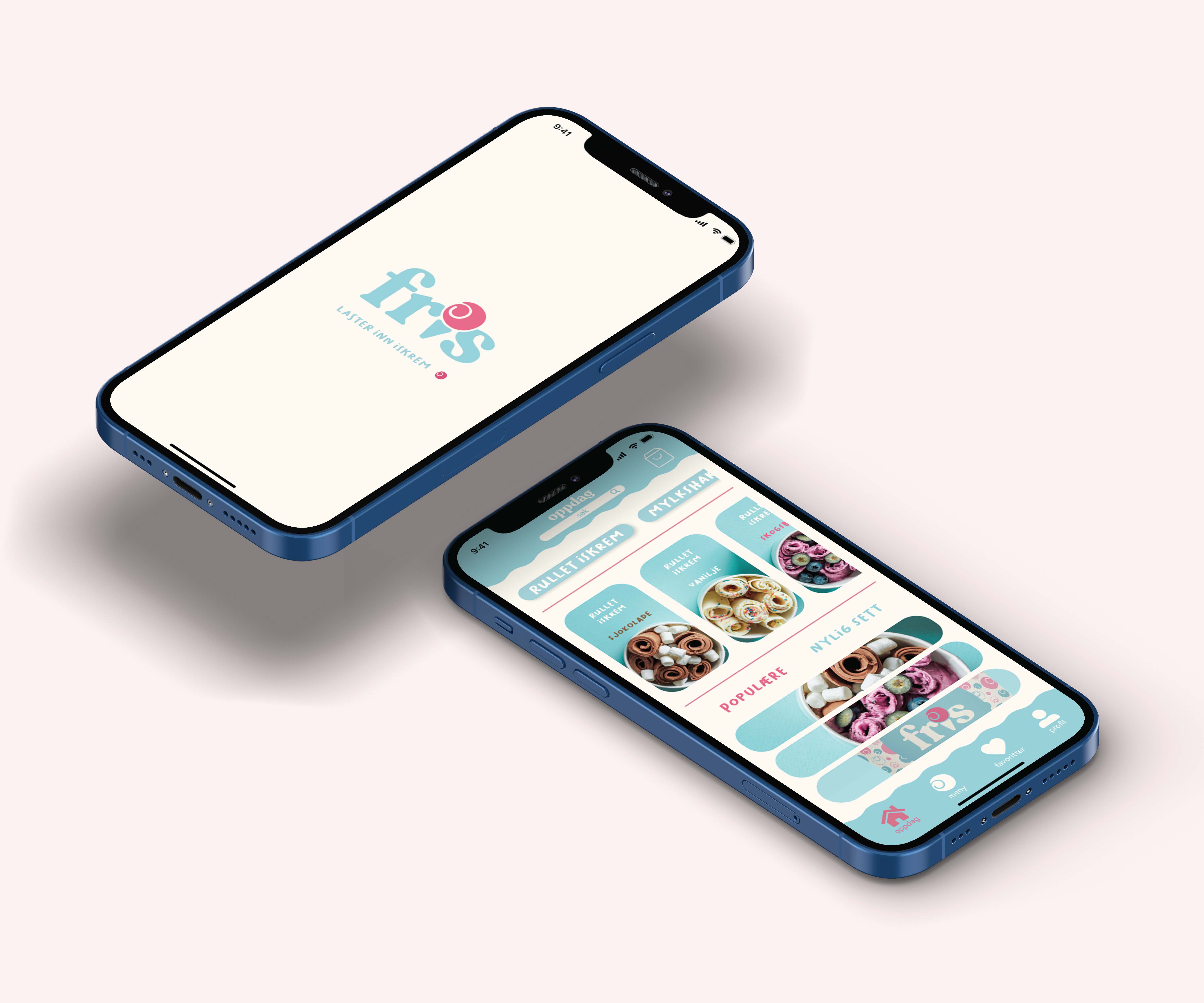
Brief: I was tasked with using a fellow student’s digital design manual to create the prototype for a digital restaurant menu for their restaurant/food concept.
Problem: The challenge was to create an app for “Fris” that not only showcased their unique offerings of allergy-friendly ice cream and milkshakes but also provided a user-friendly interface that effectively communicated their commitment to catering to specific dietary needs.
Solution: I translated and adapted the design to ensure that the app conveyed “Fris’s” core values and offerings. By incorporating vibrant visuals, clear allergy information, intuitive navigation, and easy customization options, the app enabled users to explore, order, and enjoy their products without the concern of allergies.
Learning: This project highlighted the significance of tailoring design to cater to a niche audience. Crafting an app that not only presented the products attractively but also provided crucial information for individuals with dietary restrictions emphasized the importance of user-centric design. The project also showcased how collaborative efforts could enhance and build upon existing designs to suit specific brand identities and objectives.