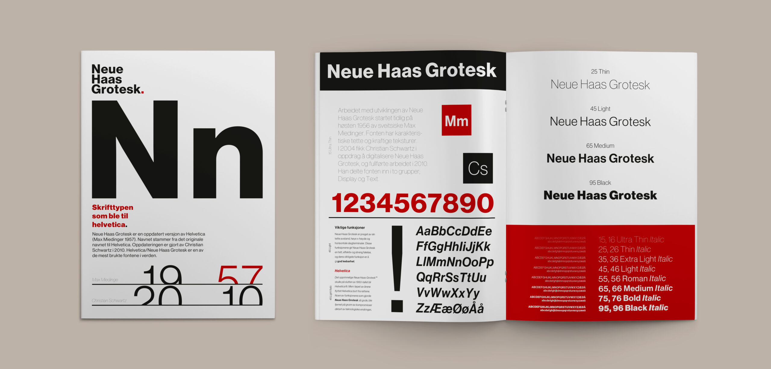
To effectively emphasize and illustrate the versatile applications and unique attributes of the Neue Haas Grotesk font, I designed a font brochure aimed at professionals adept in typography.
Duration: 2 weeks
Method: Research, persona, sketches, layout, colour theory
Tools: Adobe Illustrator, Adobe InDesign
Client: Fonthuset AS (Not an actual client / school assignment)
Context
Brief: FontHuset AS entrusted me with the task of design development for a brochure aimed at presenting a typeface (font). The target audience includes professional font users, such as graphic designers and typographers.
Problem: The brochure is intended to both inform and inspire. It should come across as clear and functional, with emphasis on readability and legibility. Simultaneously, it should also possess an appealing aesthetic through deliberate use of layout and color, maintaining an attractive visual expression.
Solution: I emphasized the diverse applications of the font and showcased its distinctive attributes, including the sleek lines and contemporary appearance of the sans-serif design. The incorporation of red color draws inspiration from the Swiss flag, paying homage to the font’s Swiss creator and ensuring high contrast and legibility against both the black and white elements in the brochure. The overall design boasts a modern aesthetic, perfectly suited for graphic designers and typographers.
Learning: Through the font brochure project, I learned how to balance aesthetics with functionality, emphasizing readability and layout, whilst using color strategically. Additionally, I developed a deeper understanding of the significance of color choice and its impact on legibility.