brilleland app
About the Project
Description
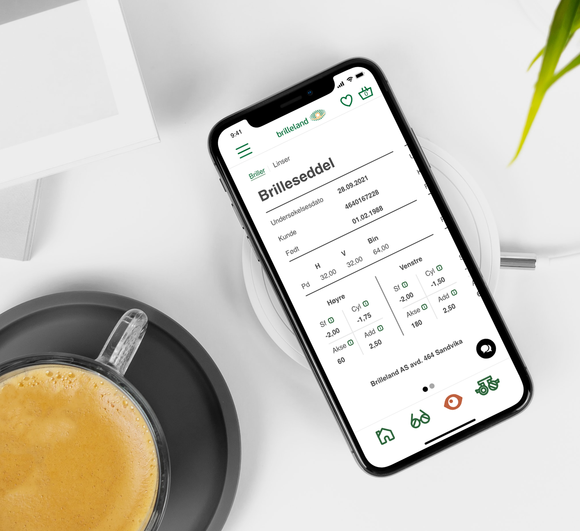
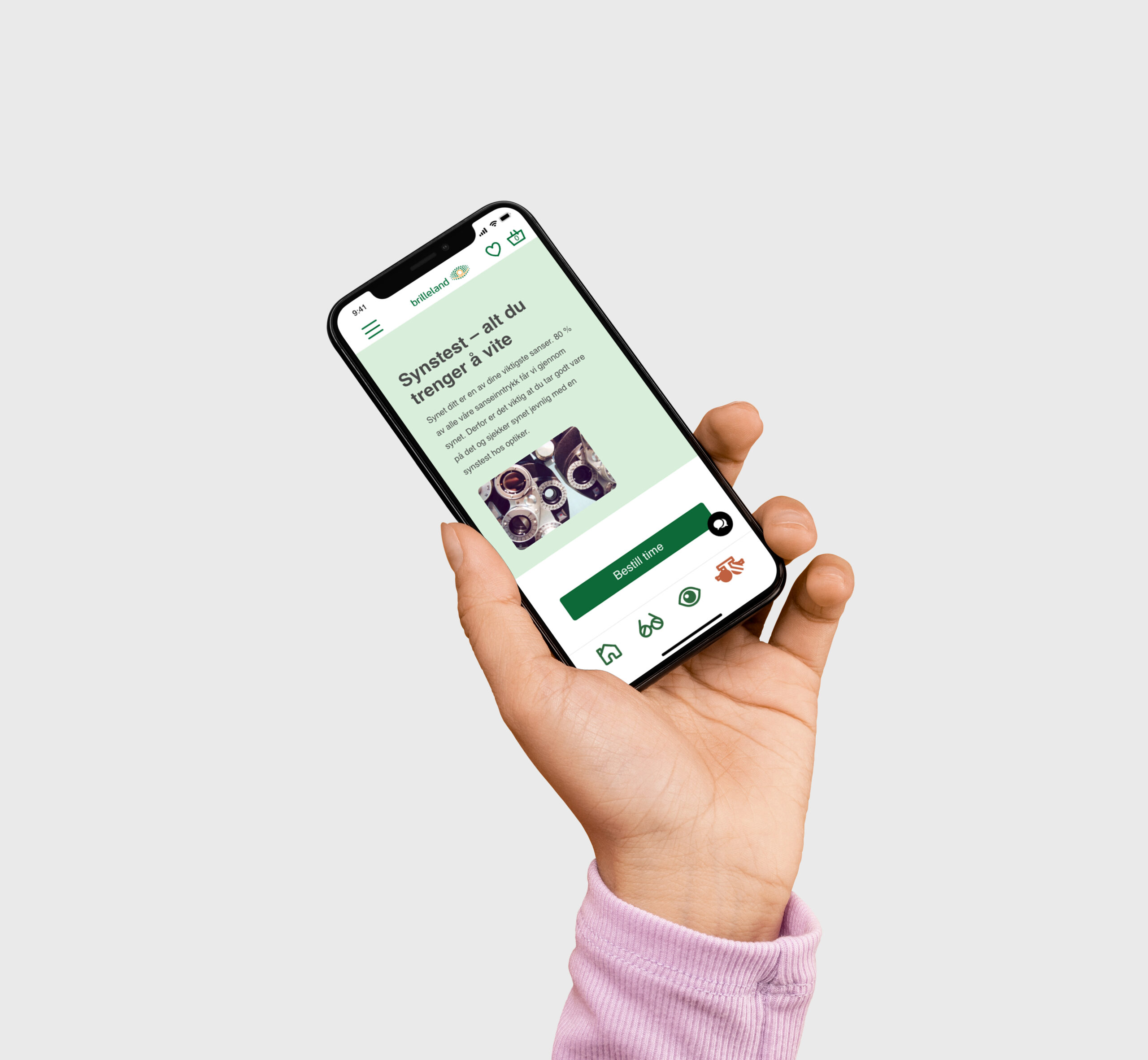
In a tightly competitive eyewear market, my classmate and I created a multifunctional app that provides various services,
giving the Brilleland brand a distinct advantage over its rivals.
Duration: 3 weeks
Method: Research, moodboard, persona, target audience, style board, sketches, wireframes, layout, prototype
Tools: Adobe Illustrator, Figma
Client: Brilleland


Context
Brief: In response to the fierce competition within the eyewear market, my classmate and I embarked on a project to develop a versatile app that offers an array of services, aimed at providing Brilleland with a unique edge in the market.
Problem: The challenge was to differentiate Brilleland in a crowded eyewear market, where customers are increasingly seeking convenience and added value beyond just purchasing eyewear. Brilleland needed a solution to stand out and offer a holistic customer experience. We also worked on this project as a school assignment without having Brilleland involved, so we had to determine the necessary features to include in this app purely based on research and data.
Solution: To address this, we conceptualized and designed a comprehensive app that not only allowed customers to browse and purchase eyewear but also provided additional services such as virtual try-on, lens customization, and eye health reminders. By integrating these functionalities into a single platform, we offered a seamless and enhanced shopping experience, making Brilleland the go-to choice for eyewear needs.
Learning: This project taught me the strategic importance of understanding customer needs and market trends. Crafting a multifunctional app underscored the significance of innovation and adaptability, demonstrating how an innovative solution can help a brand thrive in a competitive landscape by meeting customer expectations comprehensively.


